

Jazz records in the LP era needed to be more than just well-recorded. The jackets that the records came in had to celebrate both the artist and the mood and feel of the music inside. Before the 1950s, shellac 78s were sold individually in bland tan sleeves or, if the artist was significant, in heavy bound volumes that looked like photo albums.
When the cardboard jacket arrived in 1951 with the launch of the 10-inch jazz LP, it presented record labels with an opportunity. The front cover needed art to let people know what they were buying. The art typically captured jazz’s spirit and mystique and connected deeply with record buyers’ emotions to pry open their wallets in record stores.
In this regard, mystique and design were collaborators in jazz’s seduction and sales—even before the needle touched the vinyl record’s surface.
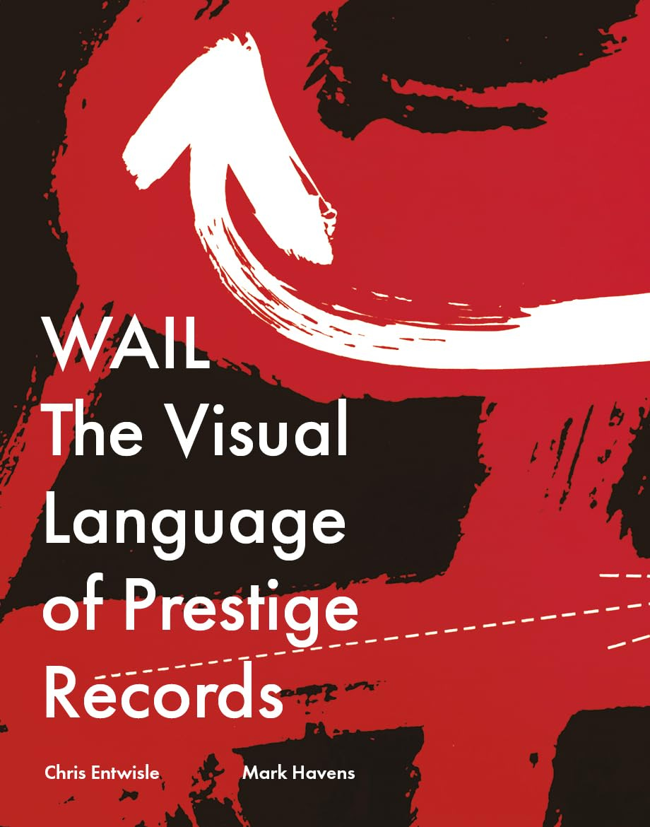
Now a new coffee-table book, WAIL: The Visual Language of Prestige Recordings (RIT Press), by Chris Entwisle and Mark Havens, explores Prestige’s cover art and the role it played in the label’s success. Chris is an artist and illustrator, and Mark is an artist and professor of industrial design at Thomas Jefferson University.
Jazz’s mystique in New York of the 1950s centered on a masculine, nocturnal cool. Musicians dressed elegantly, in a suit and tie, heavy black eyeglass frames and a herringbone overcoat. They were standoff-ish on stage and were part of the city’s underground fabric that no longer exists.
Back then, jazz was in sync with midnight shadows, screeching subway trains pulling into empty stations, the bouncy back seats of Checker cabs, the mechanical cash registers of seedy bars and the stale perfume in smoke-filled clubs. Album-cover art had to interpret or match that lonely, individualistic mystique.
Each jazz label had its own approach to design. Among the leading jazz labels in the 1950s were Blue Note, Riverside and Prestige. What separated them were different esthetic philosophies and how the jazz mystique would be interpreted with color, images and graphics.
Blue Note exploited jazz’s mystique largely through photography. Images used on the front and back covers often featured musicians at Rudy Van Gelder’s recording studio, first in Hackensack, N.J. (with Venetian blinds in the backdrop), and then in Englewood Cliffs. Most of the photos were taken by the label’s co-founder, Francis Wolff.
At Riverside, photography also played a major role, but the images used were part of a vision thought through by producer Orrin Keepnews and art director Paul Bacon, such as Thelonious Monk’s Monk’s Music, or graphic solutions like Everybody Digs Bill Evans.
By contrast, Prestige’s covers were typically handled with bold, colorful graphics that mirrored the music’s sound and mood. The artwork and typefaces were often explosively imaginative and often playful. These included Miles Davis’s Bags’ Groove, Lem Winchester’s Another Opus and Sonny Rollins’s Tour de Force. When photography was used, images shared center stage with type, such as John Coltrane’s Lush Life, Sonny Rollins’s Tenor Madness and Tadd Dameron’s Mating Call.
What sets WAIL: The Visual Language of Prestige Records apart from previous large-size books on jazz album covers is the writing. In addition to a brief but touching foreward by Sonny Rollins, the book showcases essays by Steve Heller, the dean of graphic art and design writing, along with oral-history biographies based on Chris’s and Mark’s interviews.
Included are Prestige founder Bob Weinstock, liner notes author and producer Ira Gitler, and graphic designers and photographers Don Schlitten, David X. Young, Reid Miles, Bob Parent, Esmond Edwards and others.
Through these first-person interviews, we learn the thinking that went into the covers and how they evolved. Cover art began as graphic solutions but quickly morphed into lusher presentations once the 12-inch era began in 1955 and ‘56. Colors had to be splashier with higher impact treatment, and artists needed to be featured in more compelling ways.
While the 338-page book doesn’t feature every single Prestige album cover, there are loads of them, many you probably won’t even know. And the oral-history interviews give us the voices of those we have long known just by name.
Do yourself a favor and spring for the book. I can’t think of anything more compelling to read while listening to a Prestige recording than this tome on your lap. It’s a feast for the eyes and will give you hours of enjoyment.
To buy WAIL: The Visual Language of Prestige Recordings (Rochester Institute of Technology, RIT Press), go here or here.
Tracks from five LPs featured in the book:
Here’s Red Garland’s title track from Soul Junction…
Here’s the Billy Taylor Trio playing Billy’s Ever So Easy from A Touch of Taylor…
Here’s Sonny Rollins and Thelonious Monk on Just the Way You Look Tonight…
Here’s Teddy Charles’s Violetta from Evolution…
And here’s Sonny playing his composition Paul’s Pal from Tenor Madness…
A great volume.
IF YOU USE THE RIT PRESS LINK TO ORDER YOU CAN USE THEIR COUPON PROM0 “32HOLIDAY” AND GET 25% OFF ($20)
Act fast, expires December 15.
I made myself a chrismas present and ordered the book a few minutes ago 🙂. Strangly enough my LP/CD collection is full of the labels Blue Note, Impulse, Atlantic, etc., but very few from the Prestige label. So it's also a welcome book to add to my Prestige collection. I'm really looking forward for this book. Thanks for the recommendation, Marc.